

Settl.
From a Blank Page to a Working Prototype: My First UX Project at Ironhack
There’s something both exciting and slightly terrifying about being handed a brief that says: pick a problem, solve it.
Project Duration:
7 day Sprint
Scope:
UX Research - UI design - UX design
Project members:
4
Tools:
Figma, Claude Ai, Gemini, Figjam AI
Finding Our Focus
Before moving forward, we hit our first snag: we didn’t know exactly who we were designing for. We eventually settled on people already living the immigration experience: their retrospective perspective felt more grounded. We split up to find interviewees individually, drafted questions separately, then voted on the ones that really zeroed in on language struggles, administrative pain, and how people felt through all of it.
Picking the Topic
We landed on immigration almost immediately: it’sbroad enough to have multiple angles, specific enough that real people were living it every day. Early research pulled up personal blog posts of people navigating bureaucracy and language confusion in France, and two themes kept surfacing: the language barrier and the administrative maze.
The Interviews and the wall of Post-its
Once we had the interviews, the affinity diagram work was genuinely satisfying. Post-its everywhere, keywords pulled from conversations, themes emerging from what had felt like scattered stories. Seeing those clusters appear was one of those moments where the research suddenly felt real.

The user journey map was harder. I kept getting pulled back into individual pain points instead of stepping back to see the full arc. Shifting from what’s wrong here to what is this person actually going through was the real challenge: and the real lesson.

Ideation & Going Lo-fi
The round robin exercise was the highlight. Building on someone else’s half-formed idea pushes you past the obvious. Combining our individual task flows into one group version was also revealing: each of us had missed something the others caught. Document uploads, profile creation, edge cases. A good reminder that collaboration isn’t just nice to have: it makes the work more complete.
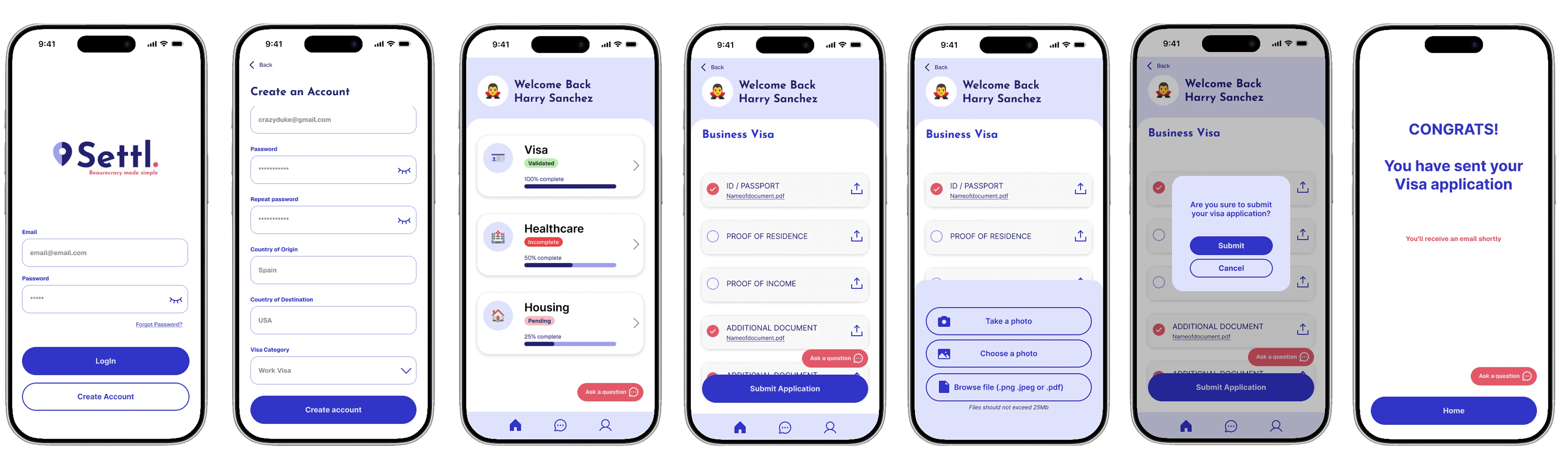
Wireframing was the moment things became tangible. Seeing flows translated into actual screens made the product feel real in a way diagrams don’t. The dashboard was trickier than expected: fitting everything onto a screen forced decisions we hadn’t anticipated. And user testing feedback was humbling: elements we considered essential barely registered for the tester. That outside perspective is worth more than it’s comfortable to admit.



Looking back
Ten minutes goes faster than you think when you’re telling a week’s worth of work. Time management is its own skill, and mine needs work. The wireframe section ran long. But stepping back: I left proud of what we’d built, and with a much clearer sense of what design thinking actually means when you’re in the middle of it.
The preliminary work is the work. That was the biggest takeaway.
More Projects


© 2026 - Sophie Berberian
